Sections
Project Year:
2017

This project is all about re-branding myself before I head into the digital media industry. I felt I needed to come up with a consistence brand, which allow people to be able to identify me.
The problem I had with my old brand was that no real thought process had gone into the colours, fonts and even the logo design. I felt that the brand would not hold up industry and I wanted myself to be taken more seriously and presentable.
For me not to make similar mistakes when it came to branding myself, I felt I needed to conduct research into other people's brands because it would give me a better understanding. I mainly used 'Pinterest' because it is a good platform to seek professional quality work and it would I would better know what makes a good brand and bad one.
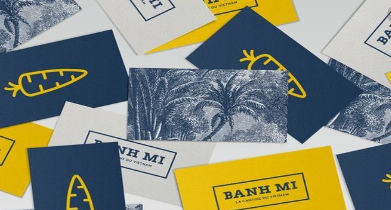
This person has branded their business/themselves using a simple 2D dimensional carrot. This informs me that the logo for a brand does not need to be overly complex, and also that the logo has to represent something to the brand and yourself. This branding has used three different colours, I feel this is a good point to note down because the branding works quite well with only just three colours.
The appeal I had towards this branding was that it stood out from the page, especially through the use of vibrant colours; the colours compliment each other well and the white against the dark blue background really pops out. THe font used also helps in making 'Wok' stand out from the page, the designer has thought about the way colours and fonts would work together to create an appealing brand.
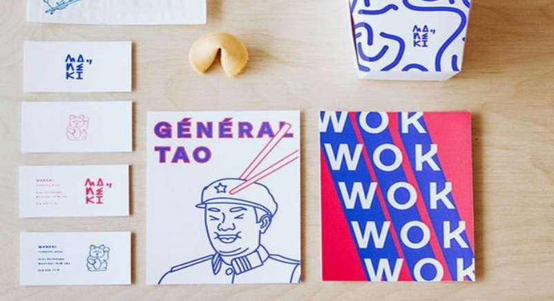
This is brand has used a bold colour which grabs the attention of people looking the branding. This brand uses three colours just as the others, the three colours seems to be a conquering theme.
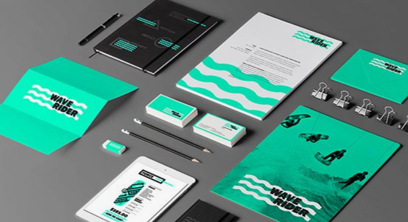
After researching into the various different brandings I found that most I saw were using just three colours, I am guessing because it is manageable and if more are used then could mean some colours will miss out. This why I have decided that my brand will only have three colours.
I searched the meaning of each colour before making the decision of using it within my brand. I found the meaning of blue was 'Loyalty, trust and integrity'. These are all traits I want to be associated with brand, because I want potential consumers/customers to be able to trust my brand and that it was integral. The reason behind the black is because I found that it is 'strong, formal and sophisticated'; I want to my brand to be taken seriously and have a sophisticated look. The meaning behind white is ' purity, complete, and neat'. By researching the meaning behind the colours I have selected it means that my brand is in conjunction with the way I would like to portray myself.
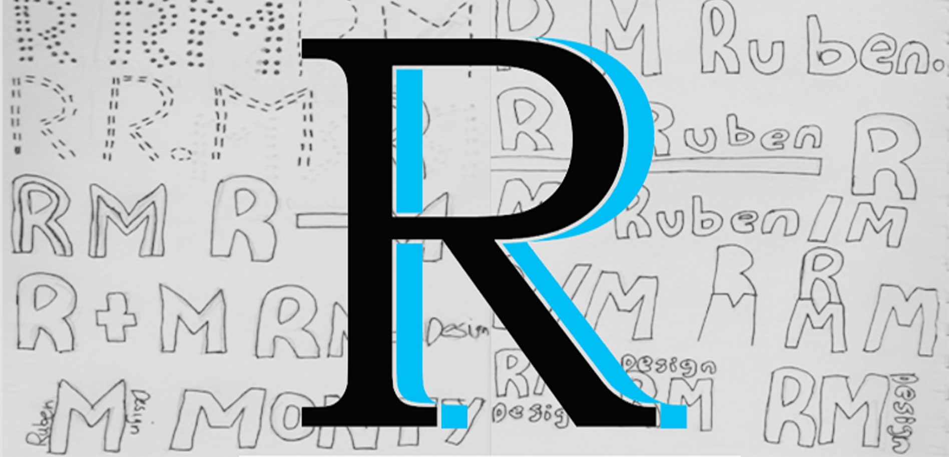
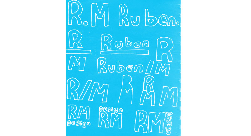
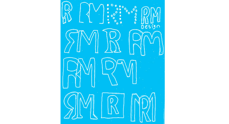
I began to sketch out various different logos, I just drew down anything which sprung to mind. These are simple in design, which was the intention because an overly complexed logo would make it more difficult to implement it into the brand.
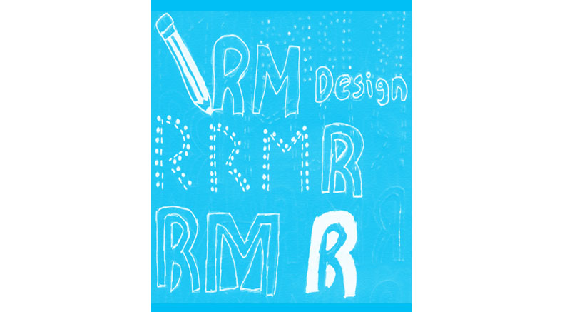
Drawing out these logos led to another ideas I can could use for my logo. The more I sketched the better the logos I was designing were getting better.
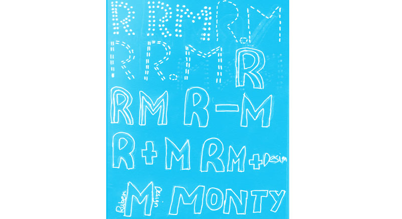
I felt it would be necessary to have a wide range of logo designs, some had similar styles but others were completely unique to the rest. The more logos I had designed the better because I would have a larger range to select from. There were both good and bad logos but I felt this is the process of designing.
When producing the logos I referred back to the sketches I had designed, it allowed to stay on track and not go off on a tangent. The logos below can be seen to use the colour palette, I had felt best suited my brand, the colours would allow me to see the different variations of the logos.
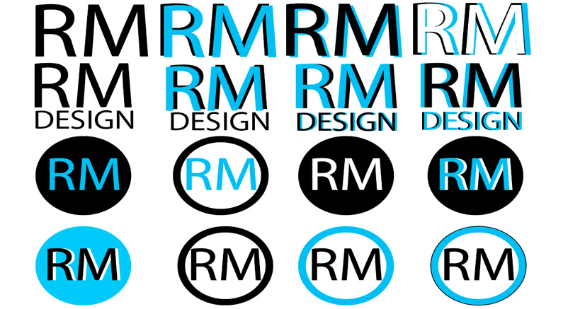
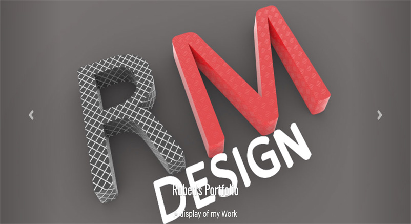
These logos were done using the 3D tool in Adobe Illustrator, The reason behind using this feature is because I predominantly produce 3D models, as this is an avid interest of mine. With the colour palette I was able to combine the different colours to see which worked well and those that did not.
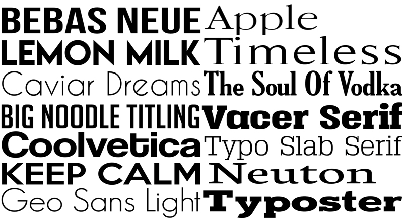
For these logos I applied the same techniques as before, I explored font types that are not traditionally used in logos, just to see if any could work out for myself, and if so it would make my brand stand out from the other competition.
These logos use a serif font, I would not normally use a serif font because it has the connotation of being formal and upholding. With that in mind, if I used any of the logos, it can send the message to users that I am serious and reliable.
After spending awhile producing the logos above, I felt it would be needed to go back to the drawing board and see what other ideas I had in store. I came up with more logos that were different to the ones I had previously done.
This is the final logo I picked for my brand, I feel the logo best represents me and that I am able to go into the industry with confidence in myself and my brand. I thought combing the typefaces would be unique and this is how I wanted to represent the brand.
For the initial fonts, I searched for serif and sans serif fonts so I could see which typeface I would select to use in my brand. I felt that sans serif would be the best option for myself
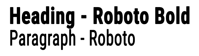
The font for my brand I went with the 'Roboto' font, it is a san serif font, I knew I wanted my brand to have sans serif because it is less formal than a serif font. Sans serif are seen as a modern font, and this is the direction I want my brand to go in. 'Over the last 15 years or so, sans serif typefaces have dominated many sectors of branding, providing a bold, no-nonsense, clean and minimalist Style' (Carson, 2017). This quote back up my reasoning for using a sans serif and this is how I want my brand to be perceived.
The branding guidelines explain how my brand works and the style of the brand. The tone of voice for my brand I feel is that it is serious, but also friendly allowing me to be approachable to outside spectators.