Sections
Final Outcome
Project Brief
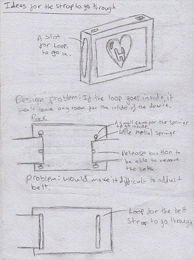
Ideas
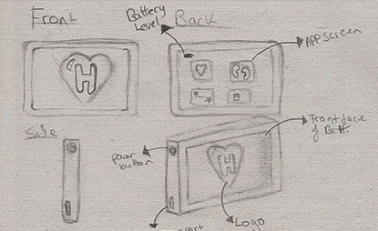
Initial Device Sketch
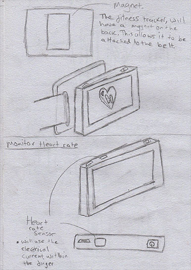
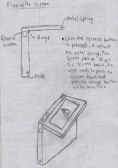
Final Device Sketch
Attaching The Strap
Solution
Colour Palette
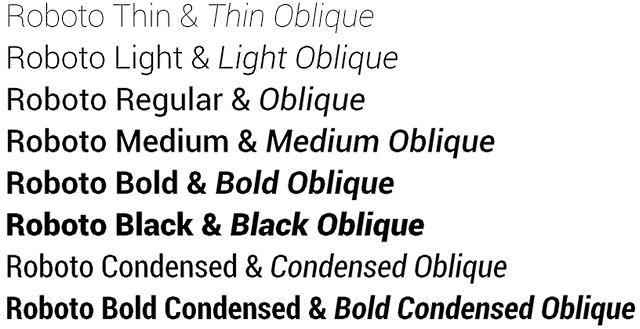
Fonts
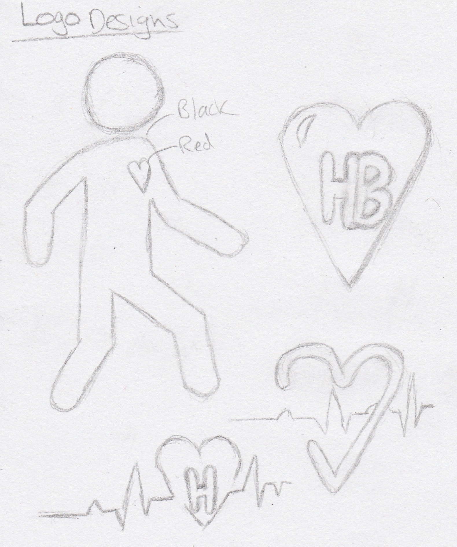
Logo Sketches
Logo Development
Final Logo
First Device Menu Sketches
Device Menu Sketches
Phone Menu Sketches
Digital Wireframes
First Mobile Menu Designs
Mobile Menu Designs
Device Menu Designs
Designs
Menu Walkthrough
Hero Image Sketches
First Hero Image
Final Hero Image
First Model
3D Prototype
Boards
Project Year:
2016
For the RSA Project, I had to pick from several RSA briefs. I chose to do wearing intelligence because I felt I could produce the best work for this brief. The description was “Develop a design solution that utilises ‘advanced textiles’ to improve wellbeing or the quality of people’s lives”.
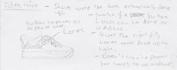
For the chosen brief, I came up with several different ideas. The first idea was a shoe where the laces would automatically lace up, once the foot was inserted inside them.
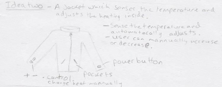
The next idea I came up with was a jacket that would take into consideration the temperature and then determine the correct heat to distribute inside the jacket.
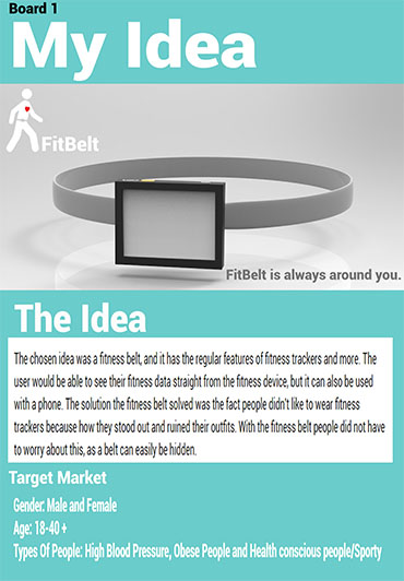
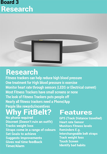
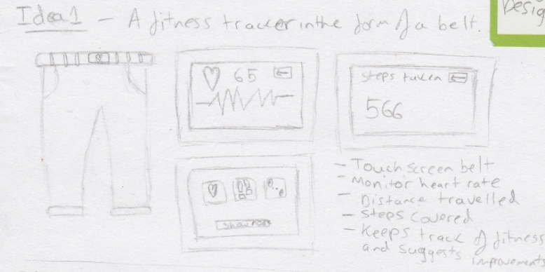
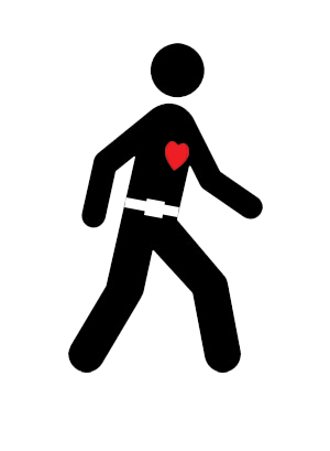
The chosen idea was a fitness belt, and it has the regular features of fitness trackers and more. The user would be able to see their fitness data straight from the fitness device, but it can also be used with a phone. The solution which the fitness belt solved was the fact people didn't like to wear fitness trackers because how they stood out and ruined their outfits. With the fitness belt people did not have to worry about this, as a belt can easily be hidden.
The first sketch I produced for the fitness belt. I kept some design features from sketch onto the final design. The problem with this design was that there was no way for a belt strap to be attached, so the design would not work as wanted.
For the final design of the fitness belt, the belt would still be able to detach from the belt strap, allowing the users to check their fitness data on the go without needing a phone. The screen can also flip out with a touch of a button, allowing the user to see fitness information without the need of detaching from the belt strap.
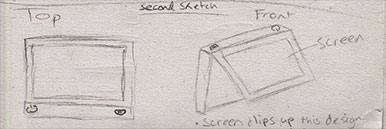
I sketched out multiple different ways to attach the device to the belt strap, but none of the designs included a way to connect the device with the strap. Other various problems would stop the belt working correctly.
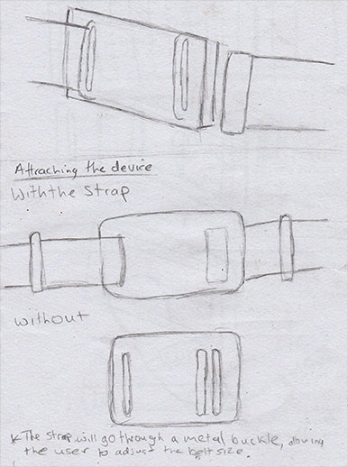
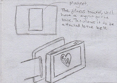
I searched the internet for ways to solve the problem I was having with the belt. I stumbled across a picture of a metal buckle, and this gave me a way to attach the device and the belt strap. By putting a magnet on the back of the device and have a metal buckle would allow the two objects to be attached.
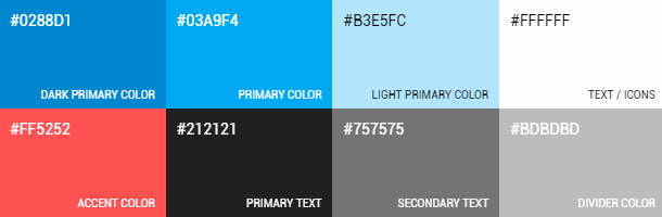
These are the colours I chose to use for the colour palette. The colours work well with each other and complement one another. I looked at other fitness apps, to get a sense of colour palettes used by others.
I tried different fonts to use for the branding, but ultimately I chosen to use Roboto regular font, I felt it worked well with the logo and menu designs.
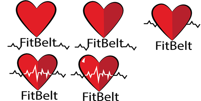
When it came to sketching the logo, I tried to incorporate elements that surround health and fitness. It is why I had a heart on each of the sketches. When people see a heart, their minds tend to think about health/fitness. The link between heart and fitness can be used to my advantaged, as the logo would not need to be explained.
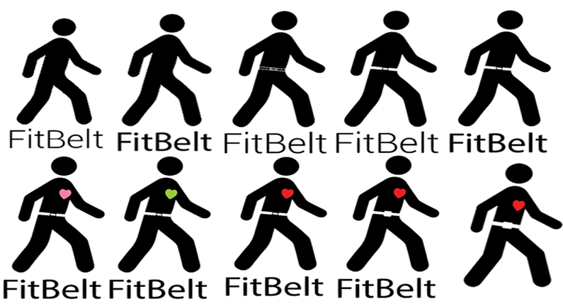
When it came to developing the logo, I created each of the logo sketches in Adobe Illustrator. The software allowed me to create my designs and once I had the first drafts of the logos, I kept on improving them until I was satisfied. These changes consisted of changing the colours, moving the different elements of the logo around, font changes and more. When it came to the colours, I tried to experiment with colours associated with health or fitness. Hence, the blue, red and green. The logos below show the steps undertaken to get to the final designs, I wanted to track different changes made to show progression.
Logo One
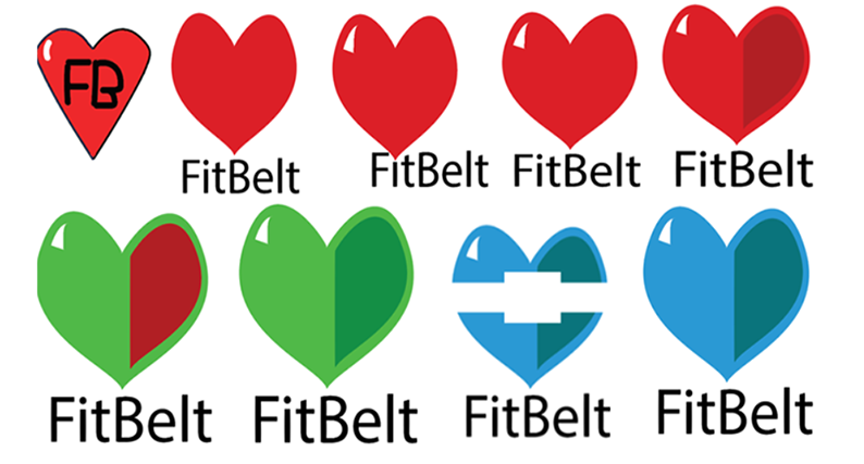
Logo Two
Logo Three
Logo Four
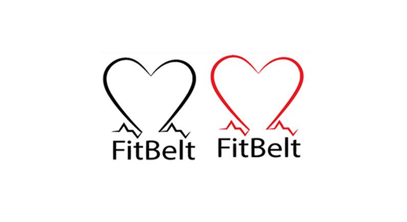
I felt all the other logo designs were good, but this logo fitted better with my idea. The final logo had more elements of fitness in it, and I felt the users could better understand the product and logo, as it had the figure walking indicating fitness, also the heart was displayed, and finally an outline of the belt could be seen.
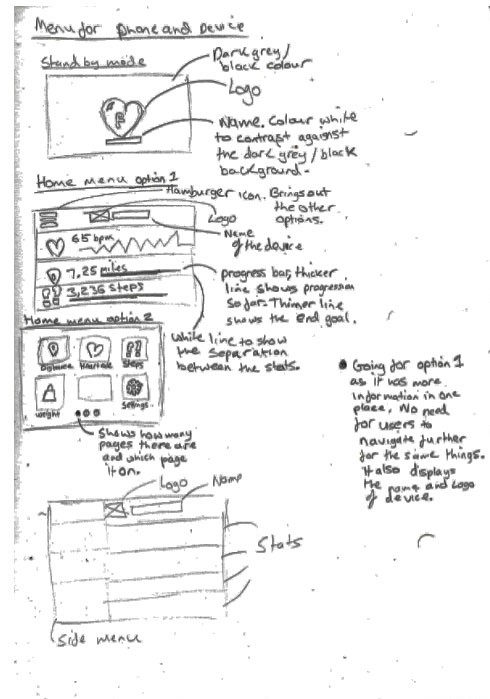
These were the initial device menu sketches, and I had two different layouts. I preferred the second option; as the user did not have to travel further to retrieve the same information, as the data was on the home screen.
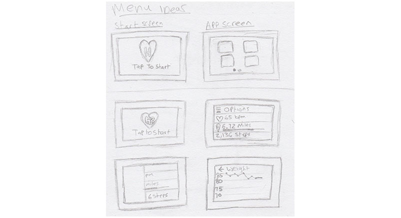
The device menu sketches just had little more detail over the layout of the content of the screens. The reason why I went for option number one was the content on the device was laid out better. Option two had more components which would make it difficult for a user to navigate.
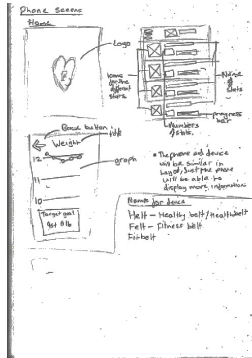
The phone sketches had similar layout but more information I was able to fit on the phone screen. The phone app is an additional to the fitness belt, as viewing does not need a phone, can be done on my fitness belt, but it is an option for people who want to view their fitness data on a larger screen.
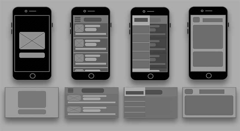
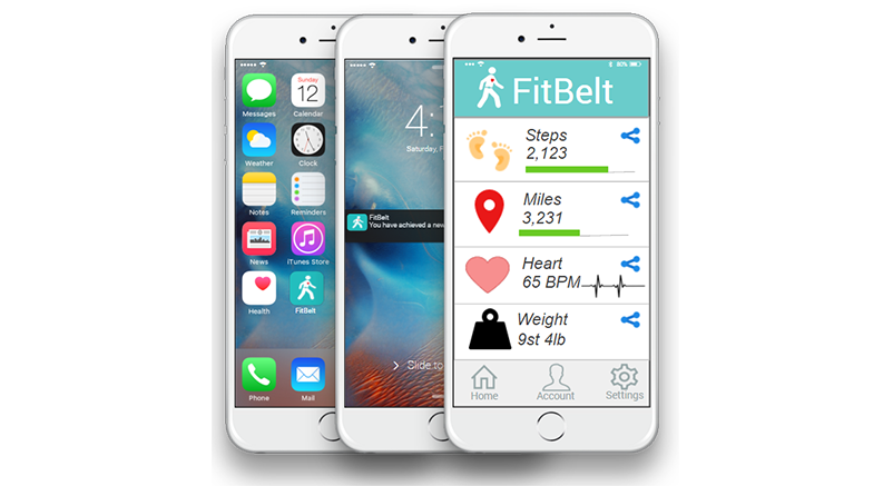
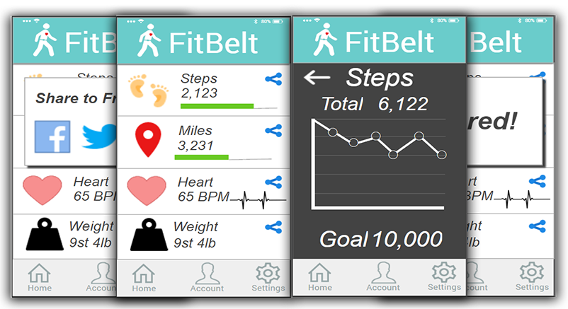
I created some digital wireframes from the menu sketches. The first screen is the standby screen, and this would display the logo and name of the brand. The second is the home screen, as can be seen on the fitness belt it is half the size of the phone app. The third screen is a view of what would happen when the menu icon got tapped; it would bring out more information for the users. The final screen is a view of the graph menu; these graphs are for the different fitness data which has been collected. On the graph it would have a progression of how the user is doing, a visual representation would be easier for the user to read.
These were some attempts at making the mobile menu designs. I put in the basic layout of the homepage, but I felt none of the design looked how I envisioned. A notable change can be seen as the menu icon from the top has been removed and replaced with fixed navigation at the bottom. This change only happened on the phone app as there was more room to have a different navigation but the device still has the menu icon in the top left.
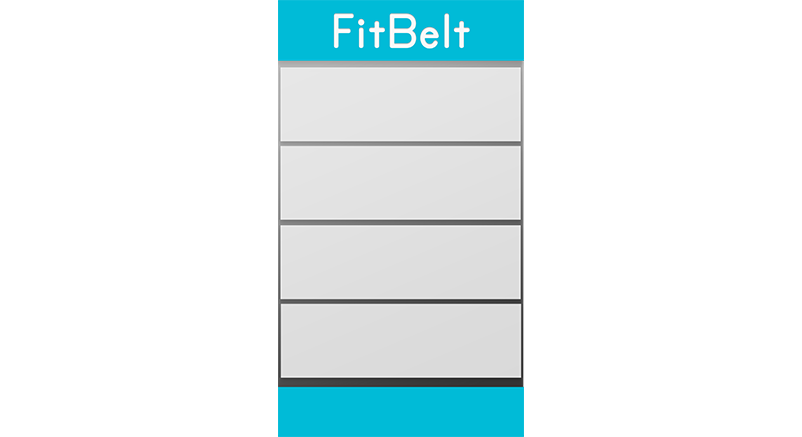
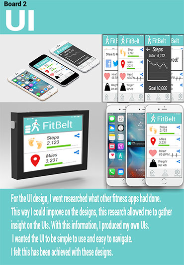
These were the final versions of the phone app; it shows the different screens featured on the fitness belt app.
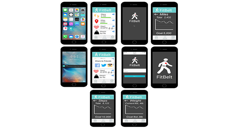
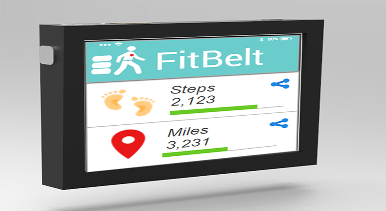
Here is how the home screen would look on the fitness device. The data is clear to read and big enough for the user to easily operate with a smaller size display.
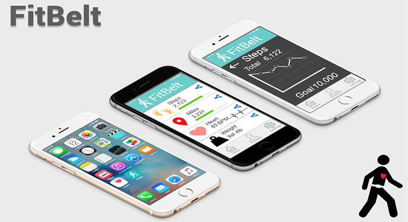
Here are a few different views of how the fitness app would look on the phone. The device would be similar, but with a smaller screen and the menu, the icon would be on the left.
The video shows go through how the FitBelt app would work on the mobile version. The mobile app and Fitbelt device would nearly the same layout, except the device would be half the size of the mobile version but work the same.
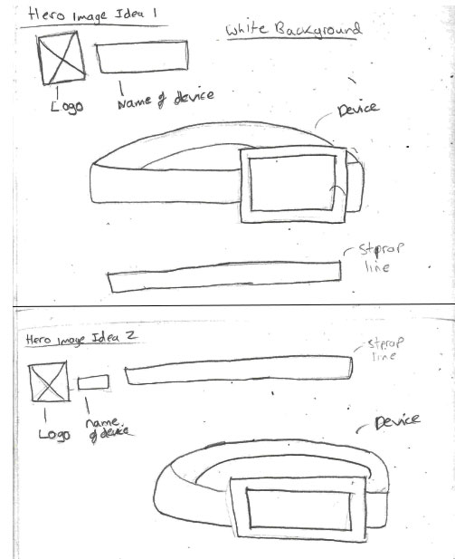
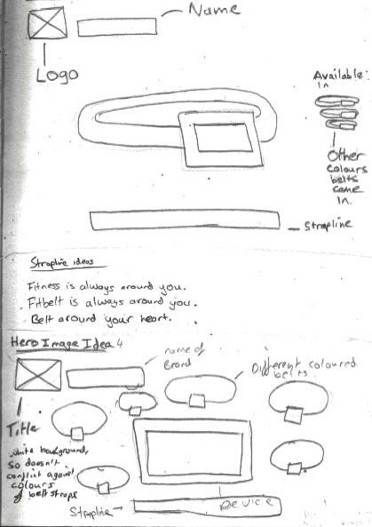
For the hero image, I sketched out a few different layouts, each of the sketches includes the strapline, logo, brand name and the fitness belt. I felt these were important parts to include in a hero image.
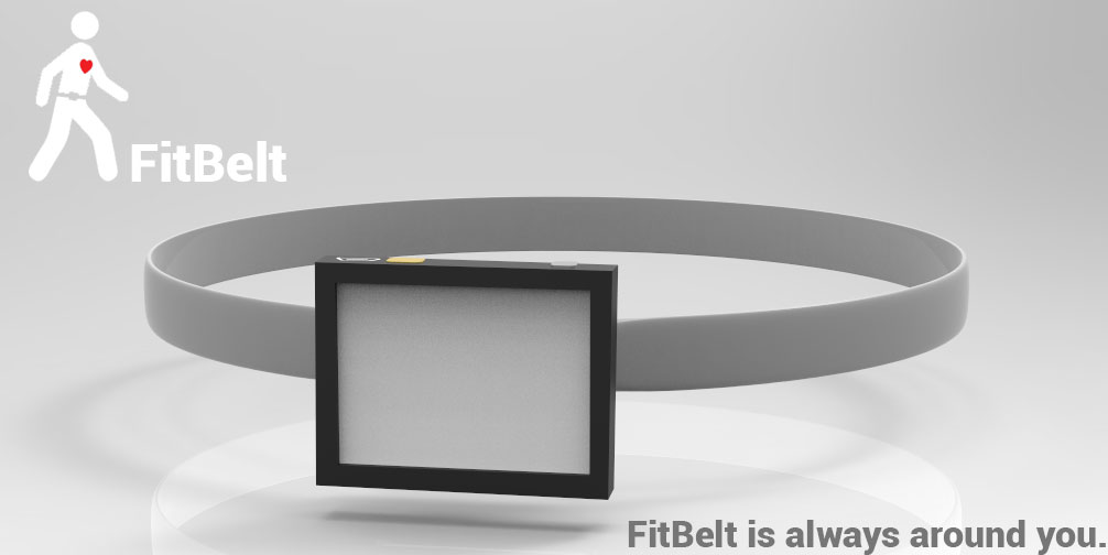
First hero image attempt got the basic concept I wanted, where the device was the primary focus, but it was not executed correctly and did not look great.
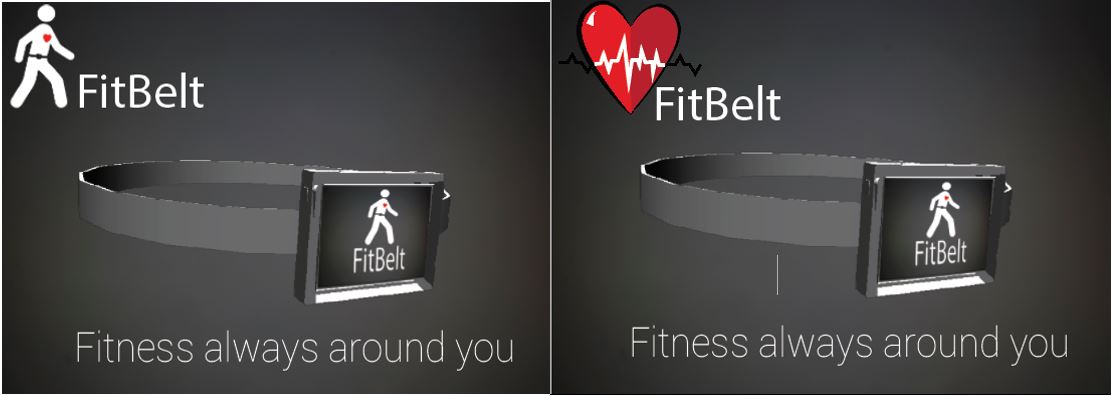
Final hero image is a significant improvement from the first attempt. The strapline is a play on words, Fitbelt is always around you, is playing on the fact the fitness belt would be taken everyone on the users' daily lives but also it’s a belt so it would go around the person.
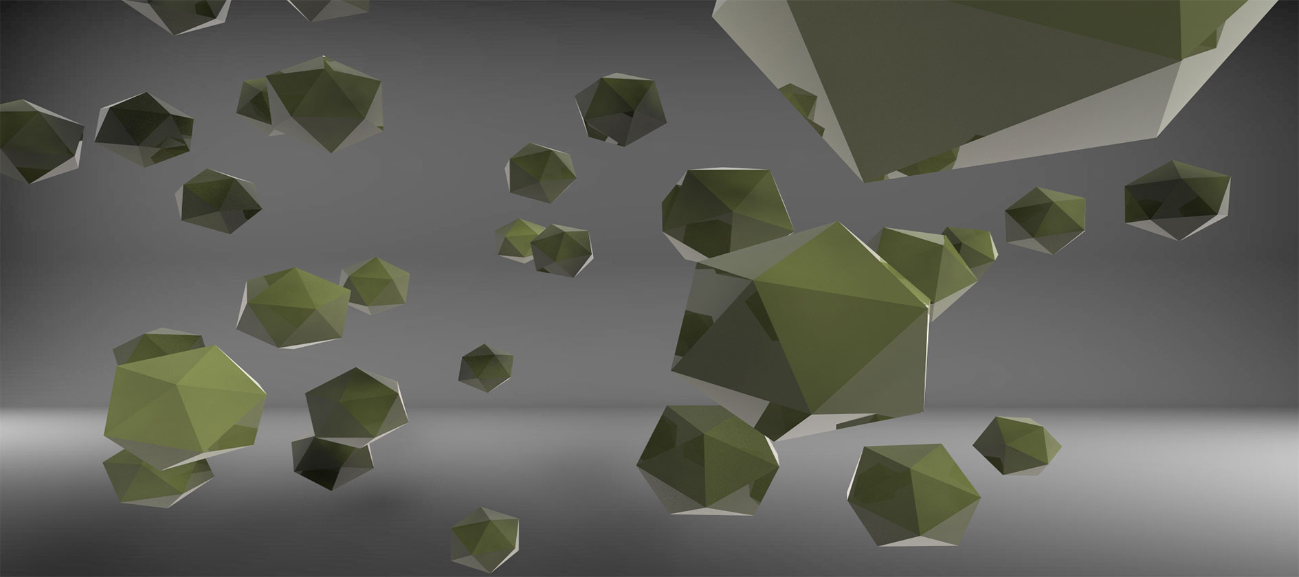
I wanted to be able to show how the fitness belt would look, so I used Maya to create a prototype. It does not come out as expected, so I had to go back to make the appropriate changes.
This is, how the 3D prototype turned out. You can move around the model and also annotations have been provided, talking about the face features. The model window even includes an animation on how the fitness device would attach the belt buckle.