Sections
Project Year:
2017
This is a personal project I set myself. In the project I would produce a concept for my personal professional portfolio website, which displayed my projects but included the final outcomes and polished imagery.
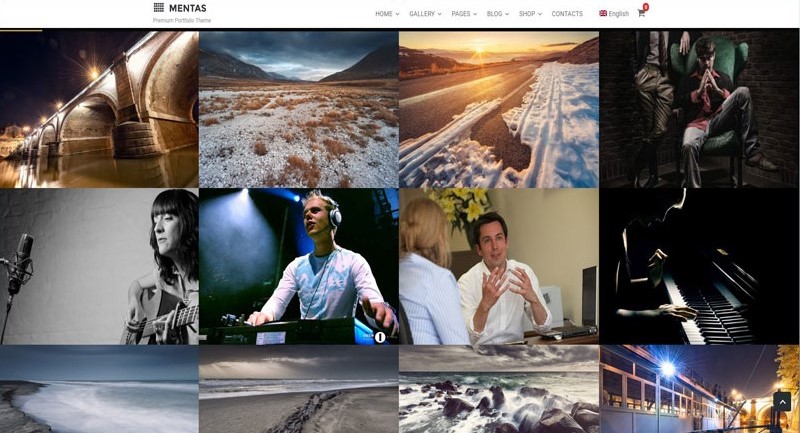
Before starting the project, I looked into different professional portfolio websites. The reason why I like the look of this site is because the projects are bold and the website gets straight to the information. The site does not have unnecessary pages and the content has been selected well.
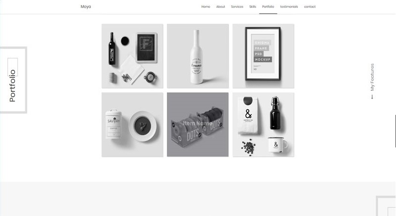
The second site has gone for a minimalist theme, the site is laid out in a way draws the users attention towards the projects because it takes up a majority of the screen. I feel the site has been produced with the end user in mind and has not been clucked with information.
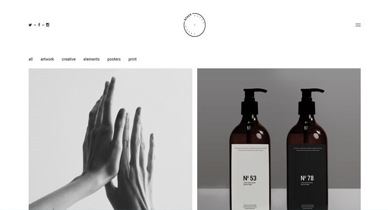
The third site again has showcased the project straight away, it means the user of the site does not have to adventure down the page to view the content. I like the way the site has been designed, it gives the site purpose and meaning. The black and white used throughout the site gives it a unique look.
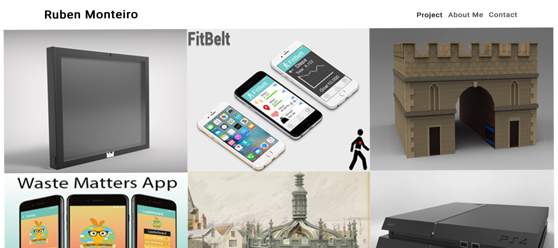
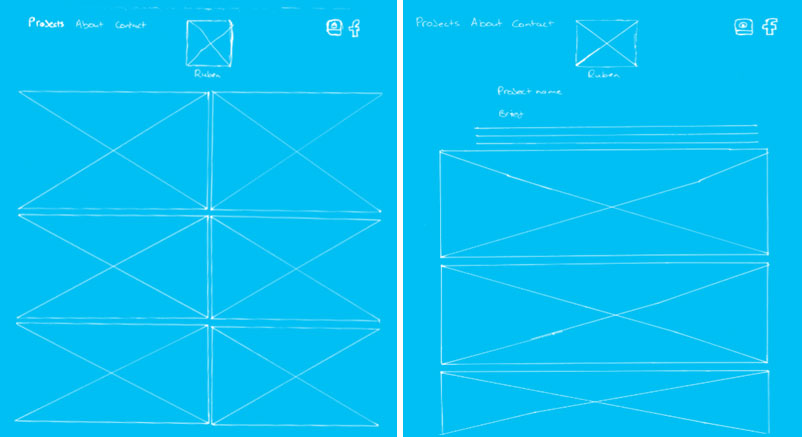
In the first design it can be seen I have taken inspiration from the websites above, by having the projects on the home of the site. It means the user has the necessary information right in front of them and they do not have to scroll down page for it. On the home page it will have my logo in top left and underneath it has the navigation for the site, also my social media pages.
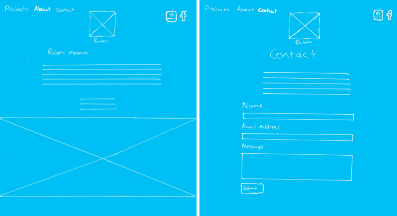
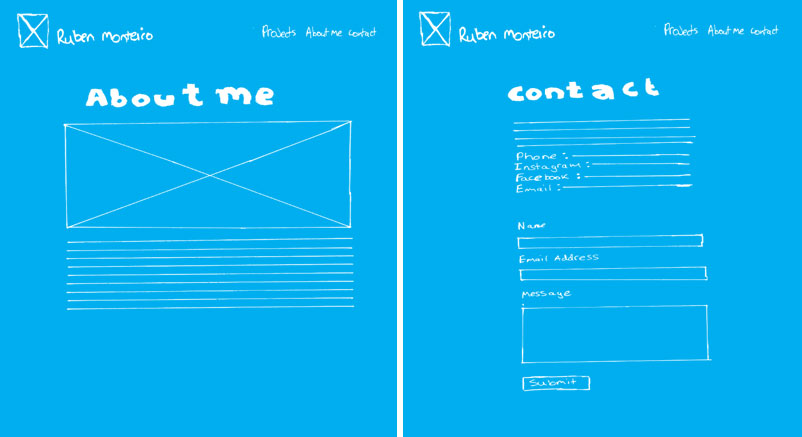
The about page features a picture of me to allow the user to see what I look like and put a face to the work. It has information about myself, so the user can get to know me more.
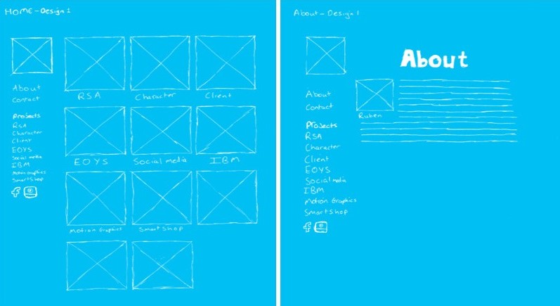
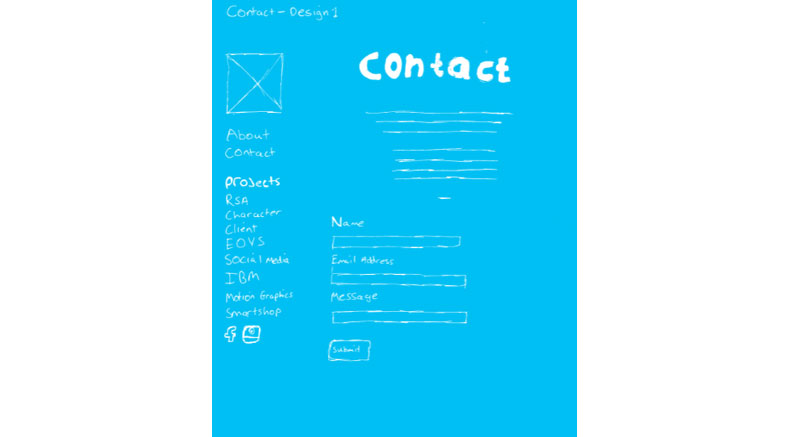
The contact page has the navigation on the left hand side to allow the user to quickly change the project, or view a different project. The contact page just contains information on ways users can reach me.
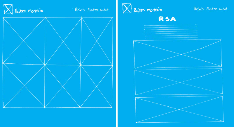
With this design the projects are displaying on the homepage because I want the user to go straight to the projects as this is the whole purpose of the site. The projects are displayed in 2 By 3 column, which gives enough space for each project. The navigation on this design features at the top of the page, just like a majority of sites. I did this to give the user familiarity when they are exploring my site.
The second sketch is how the information of the project would be displayed, it would start with the title and brief then underneath is all the final outcomes of the project.
The third sketch is the about me page and it will have information on me and a picture at the bottom, so the users know what I like.
The final page on this design is the contact page, the page will feature a contact form which people can fill out their details and message then it will send me an email. The page will also have the standard contact information, leaving the user with two options to contact me.
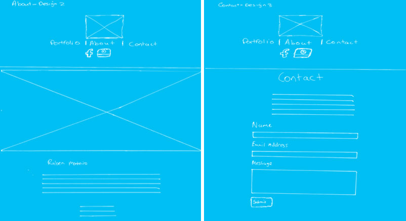
Design three has a similar layout to previous designs, it has a slight difference with the positioning of the items. The first sketch is the about page and it just has same features as the previous designs.
The second sketch is the contact page and is the same as the previous designs.
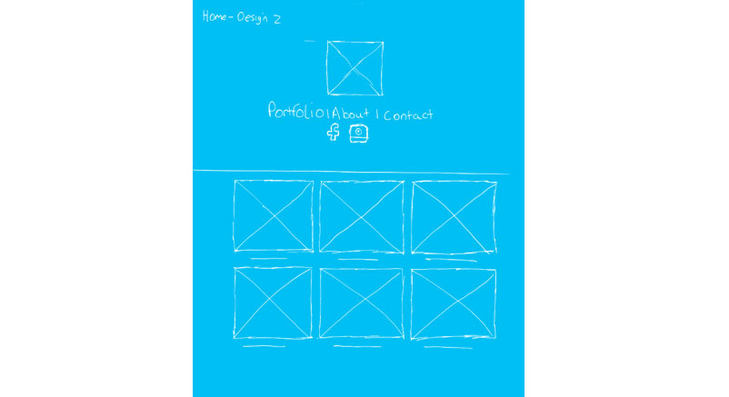
This sketch is the home/project page and it just displays the several projects I have completed.
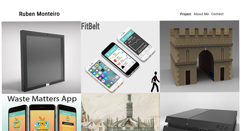
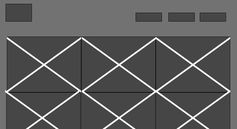
These are the wireframes I decided to advance with because I felt it had a better overall design to website. The design incorporated a minimalist theme, which I felt necessary for the professional website as it would be straight to the point. The reason I went with this design over the others is because I felt it laid out better and had minimal features to distract the users away from the projects.
I produced a digital of wireframe of the final wireframes to allow for clarification of website features and it was a chance to make any changes to site if need be.
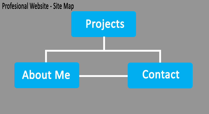
Although, this was not a big site I felt I should produce a site map to familise myself with the process of taking a website design from paper to a digital format.
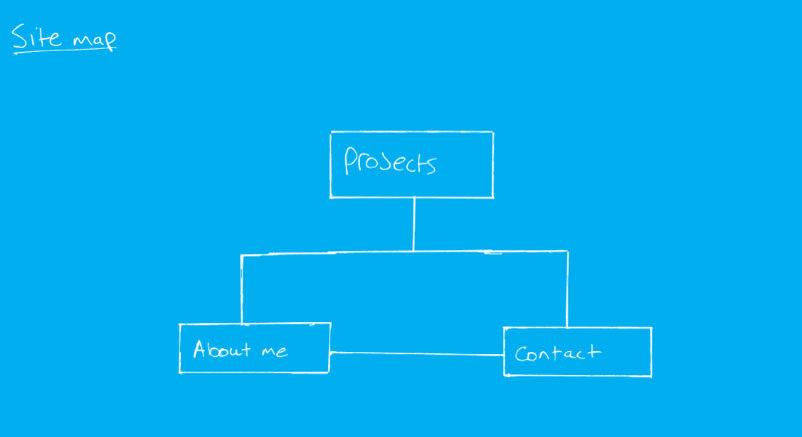
This is a digital version of the site map, which is clearer than the sketch.