Sections
Project Brief
Brainstorm
Research
Steps Going Forward
Logos
Voting/ Ordering App
Wireframes
Digital Wireframes
Colours
Fonts
Mobile Menu Designs
Designs
Boon's Designs
Callum's Designs
Final Idea
Further Research
Wireframes
Digital Wireframes
Colours
Fonts
Sitemap
Mobile Designs
Designs
Final/ Callum's Designs
Project Year:
2017
Design an innovative solution to help combat the issues of food wastage for schools and colleges.
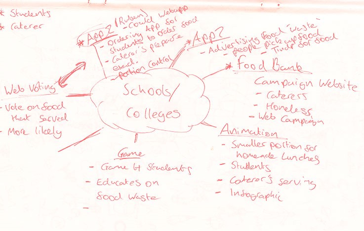
We all got together and started to brainstorm various ideas which we could develop and take on further; as a collaboration; we shared our initial thoughts on the brief. Our first idea was an app for students and caterers, which allowed the students to vote on the food and also order meals through the app. The second idea was a food bank, where students could drop off their unwanted food and at the end of the day a truck would pick it up delivering it to a composting place. Another idea we had was an app which allowed caterers to advertise their out of date food to people in need of it.
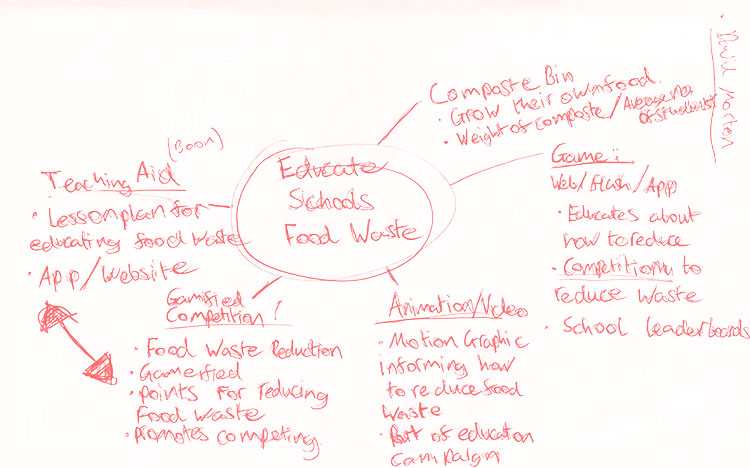
In our second brainstorm, we came up with more ideas and not just that, refined previous ideas. The brainstorm allowed us to bounce ideas off of each other and come with well thought out solutions. In this brainstorm, we decided to develop further three ideas, which were the voting app, teaching aid app and advertising food app.
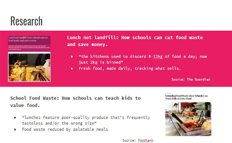
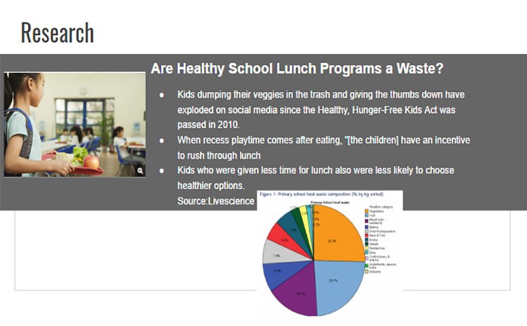
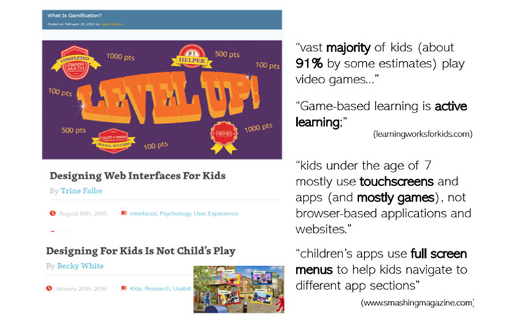
These articles were researched which we discovered the thoughts behind young children surrounding applications, and we used this information help us design and develop the different ideas. We felt the research was important before starting to work on our ideas and it would give us an indication whether the ideas were feasible.
For the steps going forward, we decided on our three ideas which we would go more depth about because this would allow us to select the best for the brief given. Each designer within the group got given an idea which they had to go and develop personally. This meant coming up with wireframes, sketches and designs for the idea. I had to develop the voting/ordering app further, I first started by looking into other similar apps to gain inspiration for my designs.
These were a few logos which I sketched out, but I did not pursue them because they did not fit into the idea I was developing.
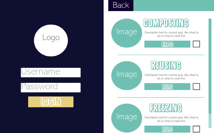
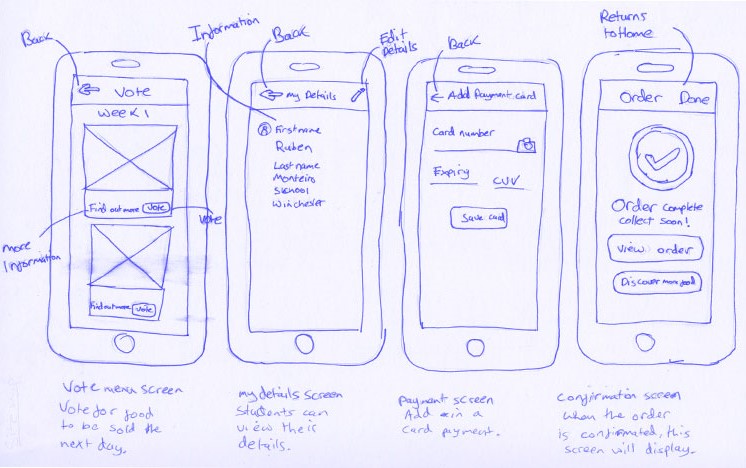
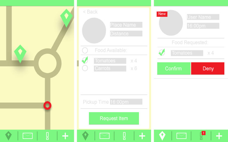
The idea for this app is a place for students to be able to vote for the food which would be sold the next day. The thought process on how this would combat food wastage in schools is the students will be voting for food they would like to eat because better food selection would increase the demand. The app would also allow the students to order the food and then select a collection time and pick up their food. It would also have a portion control, where the students can pick the size of their meal. The students would have the incentive to use the app because it would mean no need to queue and food that students want to be eat.
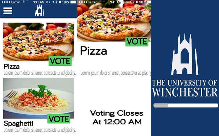
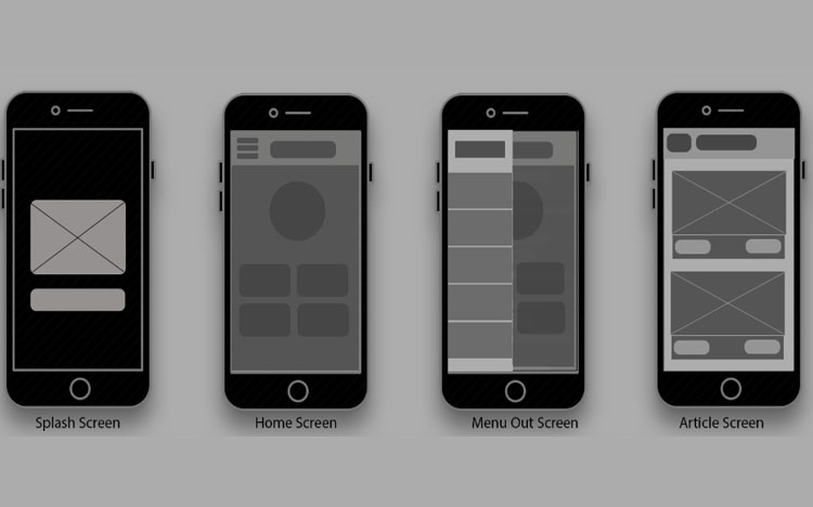
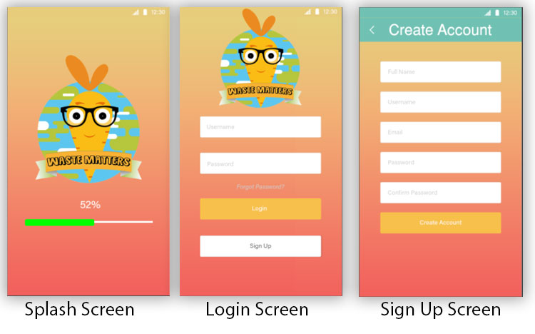
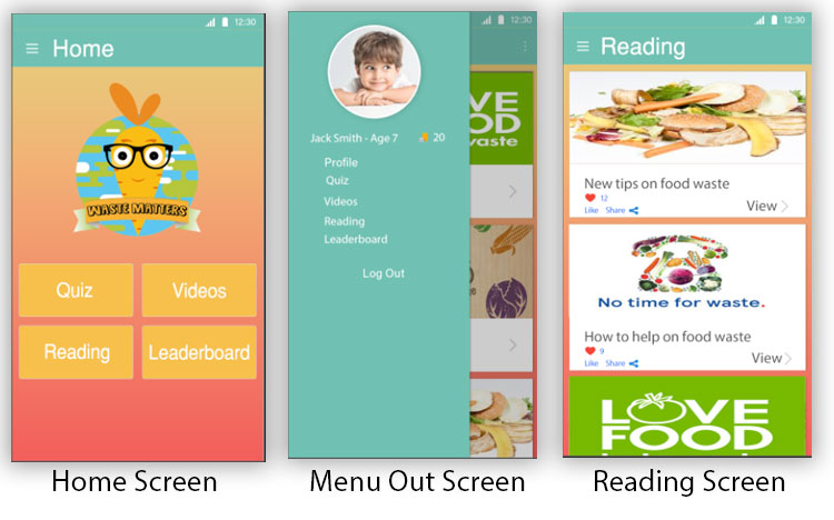
These are the wireframes I came up with for the voting/ ordering app; the app would start off on the splash screen which would feature the logo of the school to make the school feel the app is designed especially for them. After the splash screen, it would take them to the home screen, and the students are presented with the voting options straight away.
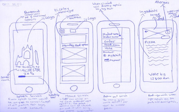
These sketches are showing the steps for logging to the app or signing up if the user is new to the app. It also shows further detail into the food menu, where the students can view what is inside and allergies. The last screen shows the steps needed to be taken to order food, it will display the options for food, and the students can select a collection time.
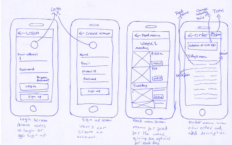
Further screens for the voting/ ordering app.
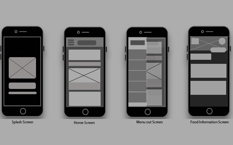
Used the sketches which I completed, and then turned into a digital wireframe to make them easier for myself to understand when producing mock-ups of the app.
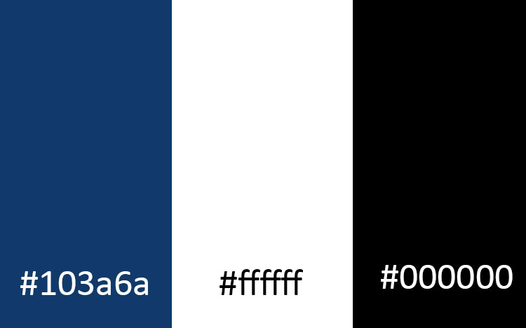
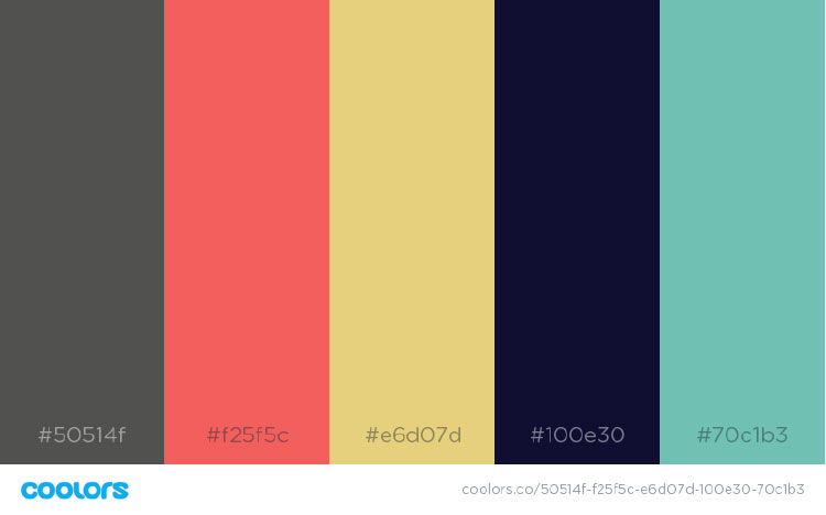
These colours are the University of Winchester colours. I have used the University as an example for the voting/ordering app to show the colour palette for the app would be different for each school. The reasoning behind this choice of the colours is that it would make the school and University feel that the app is built just for them.
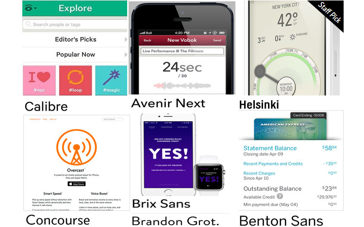
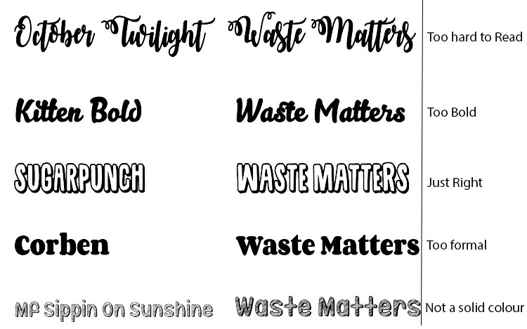
I used this website to find fonts which would work for an app. It allowed me to see fonts in the correct situation and select a few fonts which would fit in the voting/ordering app.
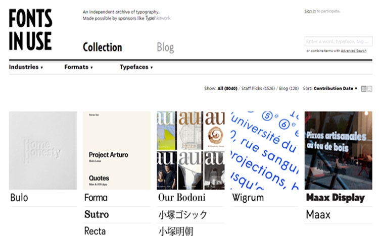
After searching for app fonts within the website, these were several fonts I considered using for the voting/ordering app. I decided to use Calibri font for the app, I felt it best suited the app, and it would get a good response from the students. The other fonts were either too formal or did not fit the vibe of the app.
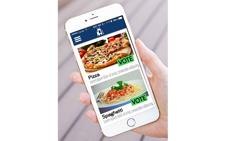
I used photoshop to mock-up a few screens from the wireframe, to bring back to my team and it would allow them to visualise how the app would work.
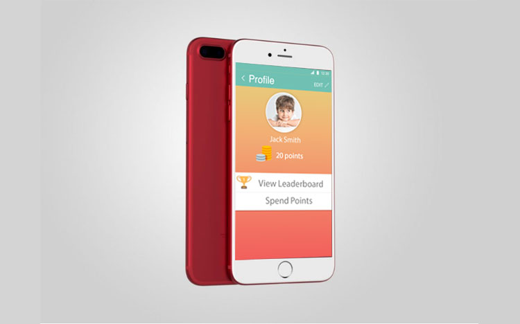
I decided to place one of the screens on the phone to help people better understand the app and somewhat bring it to life.
These are designs another member of the group came up with for the idea they had to develop on own.
These are designs another member of the group came up with for the idea they had to develop on own.
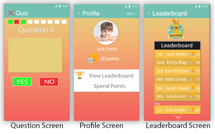
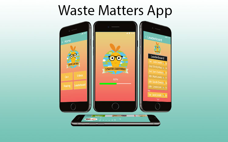
After each member of the group had got to a certain point in developing their ideas, we came together as a collective and discussed the pros and cons of each of the ideas. We all felt the educational/ teaching aid app was the best one to take forward. The thought process was, we could make a change to food wastage if we taught the students from an early age and made a difference in the logo run. The app would contain quizzes to test the knowledge of the students and rewards would be given depending on the score of the quiz. With the reward points, the students could use to purchase different items available. We are planning to gamify the app with the leaderboard menu; this gives the app a competitive side to it for the students.
The further research helped us to figure that putting in gamification into the app would help the users keep interest and want to continue using the app. Designing apps for children are different than an older audience, so we had to research into interfaces which appeal to children and use elements suggested in our designs.
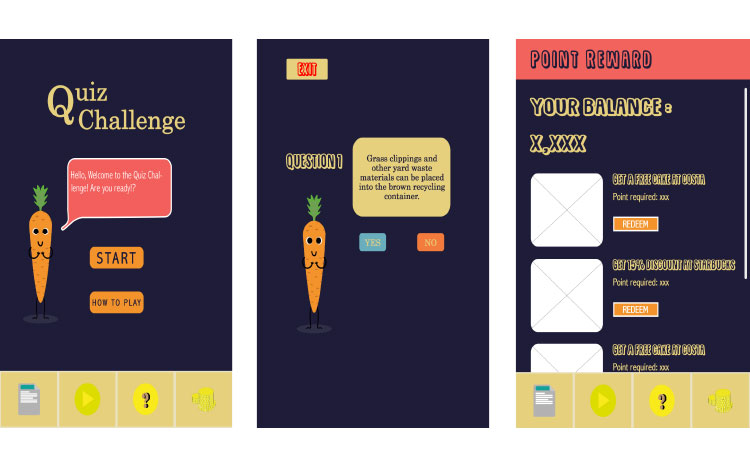
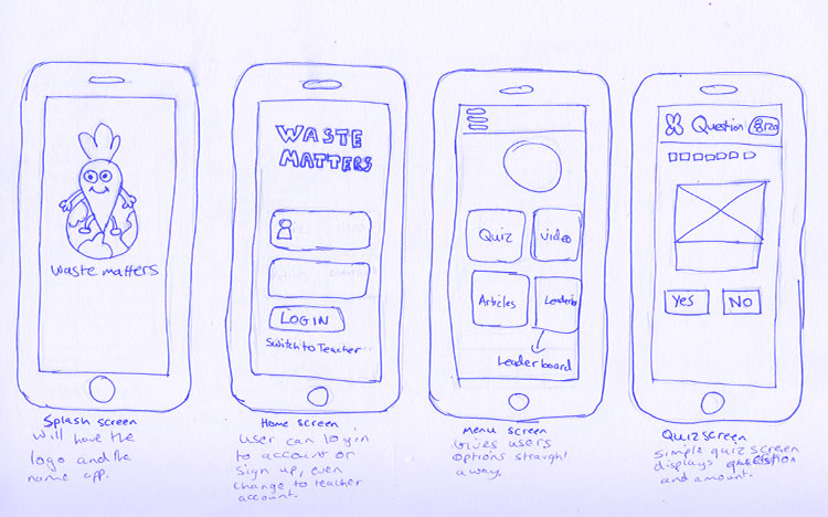
These are a few sketches of the wireframes for our teaching aid app; it shows the different screens which would feature in the UIs I did for my version of the app. It has the splash screen, log in screen, home screen and quiz screen.
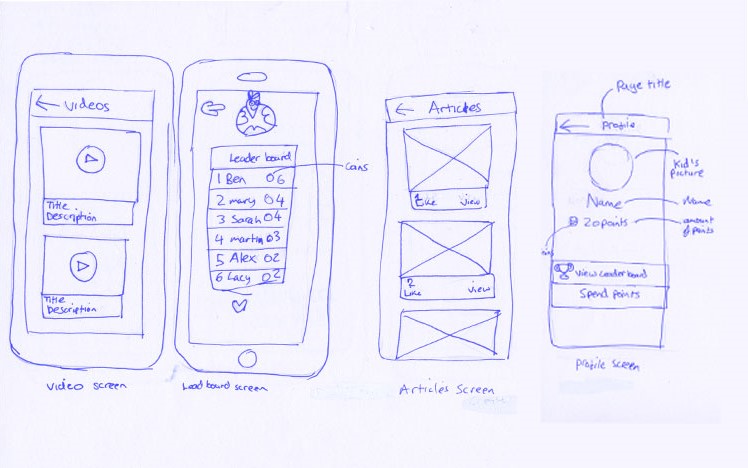
Further wireframes of the waste matters app, it gives a rough indication of how the app will navigate and the different options with the app.
Turning the wireframes into digital ones allows me to make appropriate changes to the layout etc, before mocking them up inside Photoshop.
Before selecting our colour palette, we did research into what type of colours children responded to best. We found that kids respond best to bright colours and pastel colours. With this information in hand, we selected a colour that best suited our app, the pastel colours worked well the app the best.
we wanted to use a font which was easy to read but also childlike in a sense. The font had to appeal to children and allow them to engage with the content displayed in front of them. We ended up using a font named ‘Sugar Punch’, it was cartoon style but could easily be read, which fitted in well with the rest of the app.
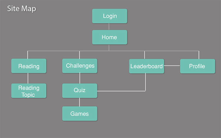
One member of the team produced a rough sitemap and then gave it to me, which I turned it into a digital version which is clear about how the app will operate.
These are how the UIs I sketched for the teaching aid turned out.
These are the designs a team member came up with for the teaching aid. We ended up going with these designs over the others because it felt the most child-friendly. We felt it would engage the children the most and it was simple for them to use and navigate around.