Sections
Final Outcome
Project Brief
Research
Personas
Sketch 1 & 2
Sketch 3 & 4
Sketch 5 & 6
Sketch 7
Modelling Process
Modelling - Prototype 1
Modelling - Prototype 2
Modelling - Prototype 3
Modelling - Prototype 4
Modelling - Prototype 5
Modelling - Prototype 6
Feedback
Further Development
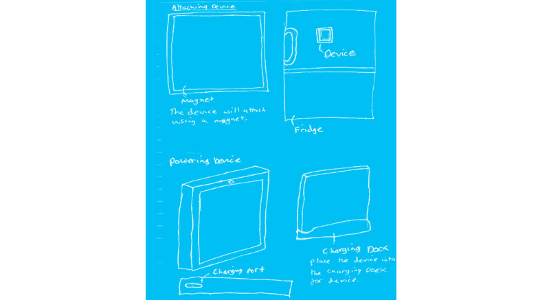
Attaching Device
Final Prototype
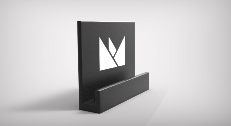
Charging Dock
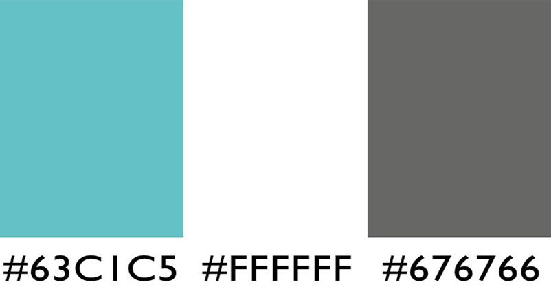
Colour Palette
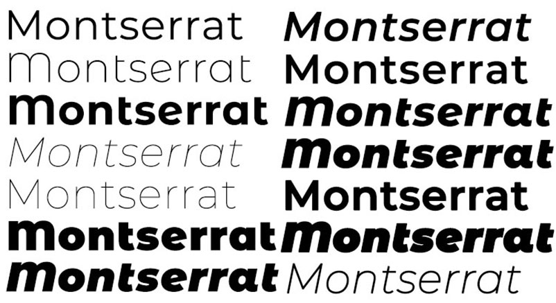
Font
Device Menu Sketch
Device Menu
Hero Image Sketch
Initital Hero Image
Fridge Ad
Project Year:
2017
For this project I was approached by a Client 'Gramsey', who wanted myself to design and model a device which would scan food items, and store information about the product. The device would need to store the type of item and when the item would expire, so the consumer would know when items would go out of date.
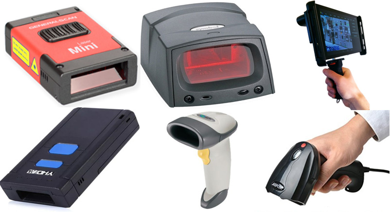
Before starting the project, I felt it was necessary to research into hand held scanners and mini scanners. The research allowed me to gather information required to put into my designs for the fridge scanners. With the information acquired from the research, I was able to choose which elements needed to be implemented into the device and which features I should avoid including.
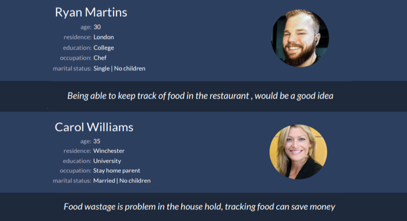
Before designing the use-by scanner, I felt it was needed that I would produce personas for the product. The personas would help me to visualise the consumers of the product, and with this information I would be better able to design appropriate product for the end users.
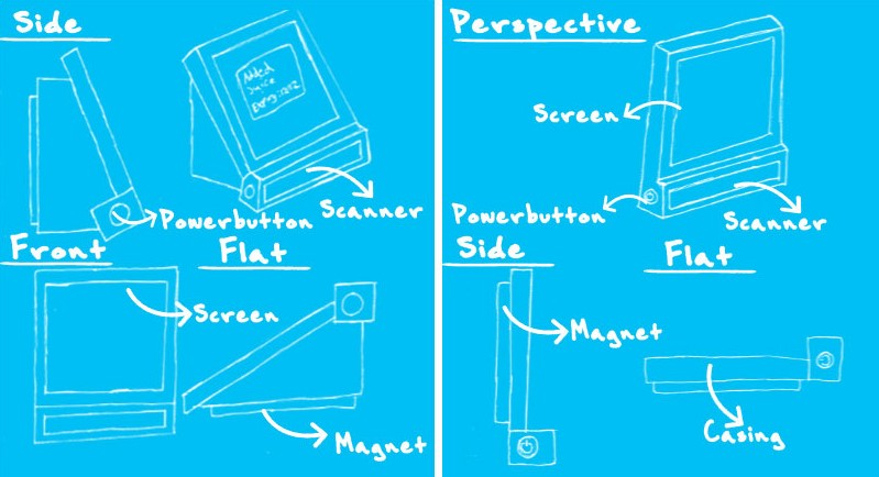
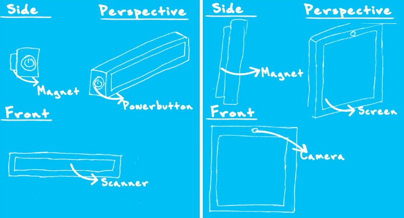
With the first sketch for the use-by scanner, I just thought of basic idea of what a scanner for the fridge could look like. I knew it would need a way for the device to attach to the fridge, so I put a magnet on the back for an easy way to connect the two objects together. On the bottom of device, it has scanner which I implemented because of the research undertaken before hand. The screen for device is tilted at a 45 degree angle for better viewing and the power button enables the user to turn the device on and off.
For the second sketch I removed the tilted screen to reduce the bulkiness of the device and give it a more slim look. I felt this improved the appearance of the device and it would not take so much room on the fridge.
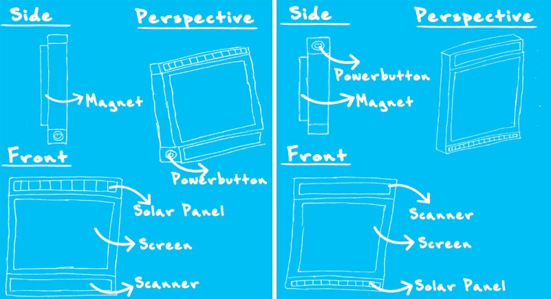
With the third sketch, I reduced the size of the scanner to fit the rest of device which gave it slim lined look. Meaning the device appeared to be one object and not as if something had been attached to the bottom. In addition, I added another feature to the device which was a solar panel above the screen, this allowed the device to receive power and be functional.
For the fourth sketch, I simply just swapped the scanner and solar panel to have a different variation of the scanner.
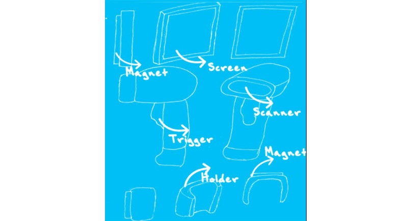
With the fifth sketch, I thought about just having the scanner on the fridge. This device would be operated in conjunction with a mobile app, the user would have the information about the foods straight on their mobile device and the scanner would not take up much room on the fridge.
The sixth sketch took inspiration from the previous sketch in the sense that it removed the other features and only one was dominate in the design. The screen was just left in the design and I added camera to allow the user to still be able to scan in the items.
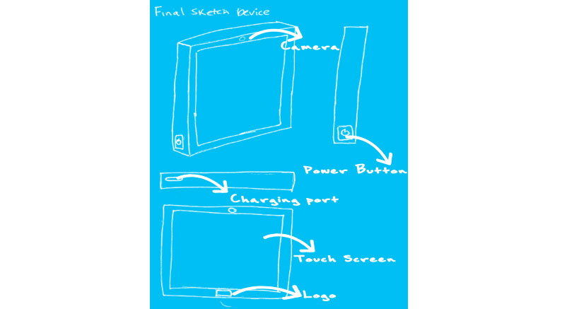
For the final sketch, I designed a hand held scanner which the user could pick up and scan the food items with ease. The hand held scanner would link with the use-by device and update instantly.
For modelling of the prototype, I used 3D software called 'Maya', as it is a program I am familiar with and would not require me to learn the software.
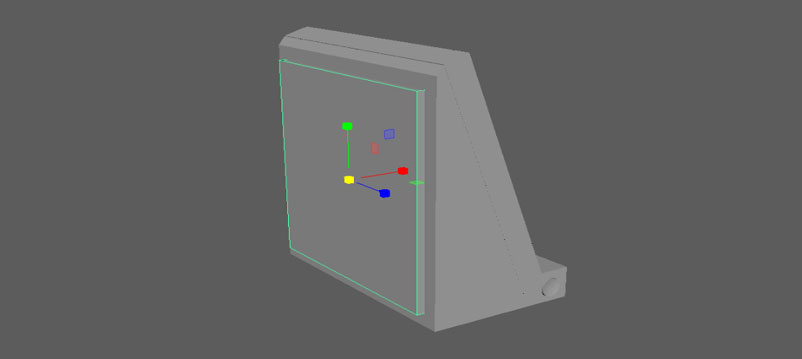
For the modelling of the first prototype, I started off by modelling a cube and reducing the width to fit the specifications of sketch above. Next step I modelled the dimensions of the screen, by simply moving face of the model inwards.
For this prototype I modelled the scanner and attached it to the bottom of the screen. Once I had done that, then I selected the screen and titled it to a 45 degree angle, so it would match the sketch I had produced.
Next I began to model the back of the device, this is where the battery and other necessary parts would be stored to make the device work. For power button I just used a cylinder shape and reduced the size of the width.
For the magnet, I just modelled a cube and reshaped the size to match the sketch and then moved it to the back of the device.
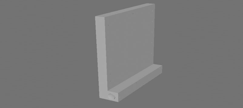
Modelling the second prototype was simple because I just used elements from the previous model and got rid of the parts which were not in the design.
Only I needed to do was model up the solar panel, which was done in no time. Once completed, I attached it to the top of the model to ensure it was same as the design in the sketch.
I reduced the size of the scanner to fit the width of the device.
For the fourth prototype, I just took the previous model and simply swapped around the solar panel and the scanner.
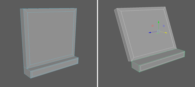
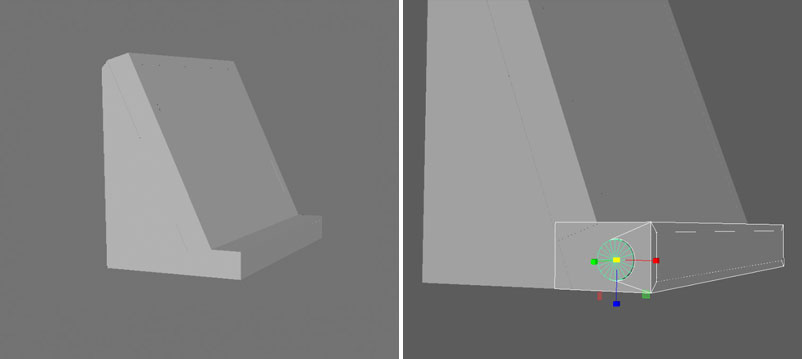
For this prototype I removed the screen and solar panel, and was just left with the scanner. I resized the magnet on the back otherwise it would have been to big to fit.
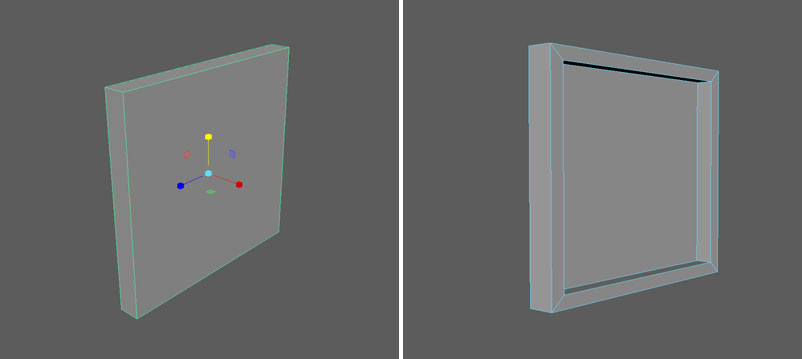
For prototype six, I modelled the just the screen and added in the camera at the top of the device.
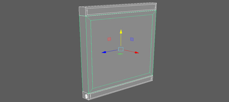
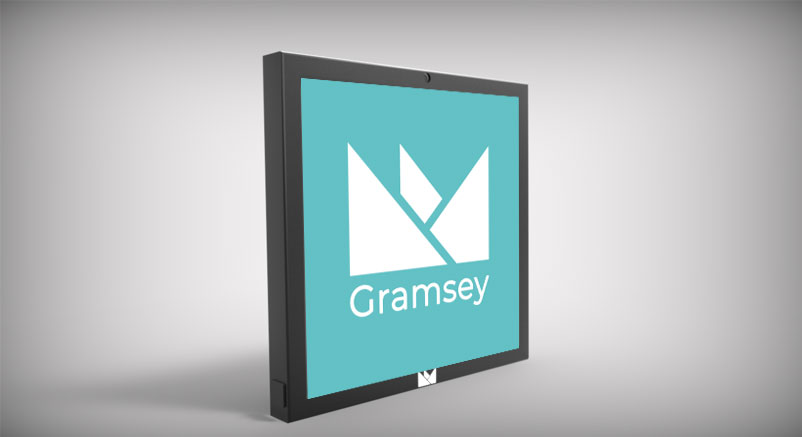
Once I completed the prototypes of the device, I showed them to the client to know which prototype they would like to go forward with. The client felt the prototype number six was the best one to proceed with. However, the client wanted me to make additional changes, for example, adding the company logo on the device and also moving in the magnet to give the device a more flush look when its on the fridge. With this feedback I knew I had to redesign the prototype to meet the client's expectations.
With the Feedback in hand, I sketched out the use-by scanner which just had the screen and no scanner. I made sure to add in the logo just as the client required. With the device not having the scanner the user would just use the camera and place the bar code in size the frame. In additional, I added in a charging port, so the device could be charged.
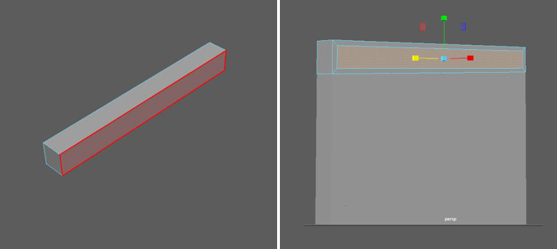
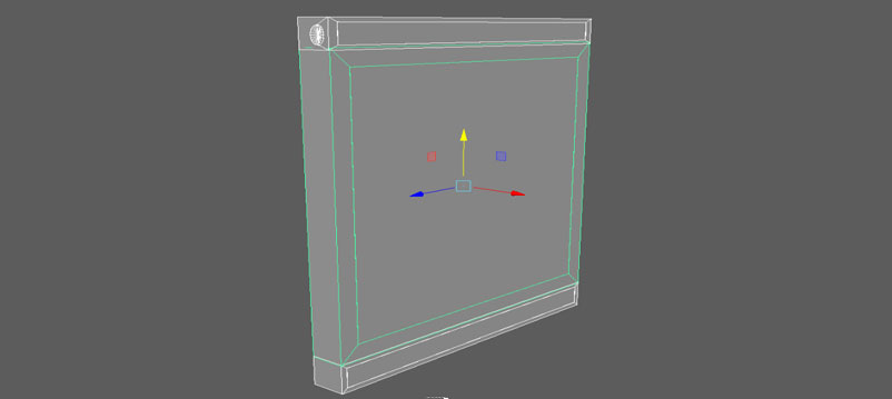
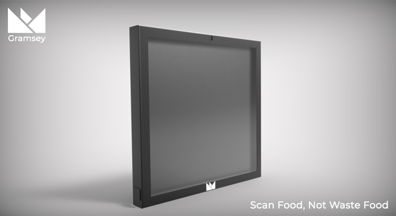
The way I thought about attaching the device to the fridge was through a magnet and with the feedback received I knew I had to ensure the magnet was not sticking out, otherwise the device not have the flush look the client wanted. I also designed the charging dock, which was a way for the users to charge the device.
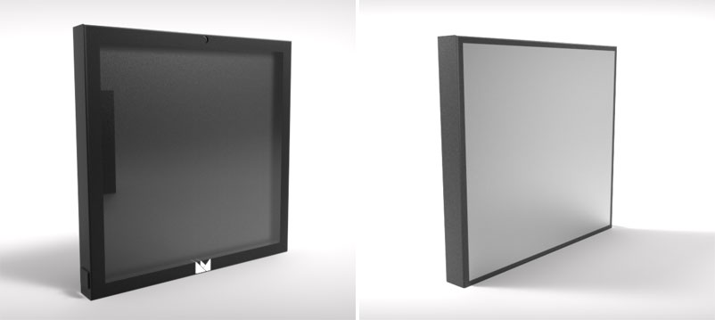
This is how the final prototype ended up turning out with all the feedback taken on board. I showed this to the client and they were happy with the final product.
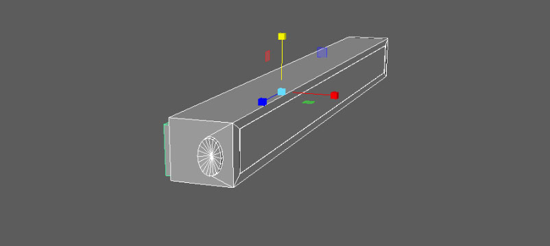
This is the charging dock, the user would simply place the use-by scanner in dock and then the device would start to charge.
For the colour palette, I asked the client which colours they had used for their website and incorporated the colours within the palette. I felt it was necessary that the colours used within the device menus, matched the rest of company branding guidelines, so it did not appear as if it was not apart of the company.
Just like the colour palette I received information about the font which the company used and it was 'Montserrat'. The consistency needed to be the same through out the company website and the menus I designed.
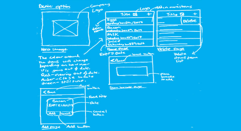
I sketched out how the menus could potentially look on the device, I had to take inconsideration that the device would not be large, so I had to make the menus were easy to operate on the smaller sized screen. This meant I could not over crowd the menus with unneeded information. I kept the menus up to three pages and only displayed the most important information. The first screen is the standby screen, and this would display the logo and name of the brand. The second screen is the home page and this would display the food items with the expiry date. The third screen is the delete/home page, this shows how the delete would work by just swiping right on the food item.The fourth screen is the adding items page, which accessed by clicking the plus on the home page. The final screen is the added food item page, it displays the user with option to add item to the list on the home page or delete the food item.
These are the device menu I produced, which has the colour palette incorporated and the font. The menu showcases how easy the device would be to use and the personas were in mind when producing the menu designs.
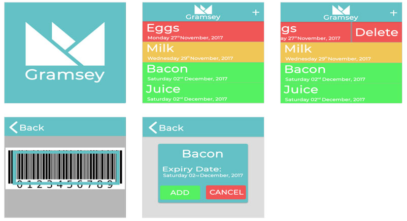
Below is an example of how the menu would appear on the device.
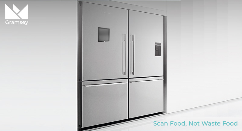
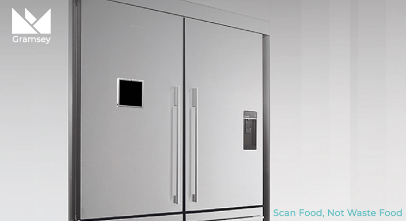
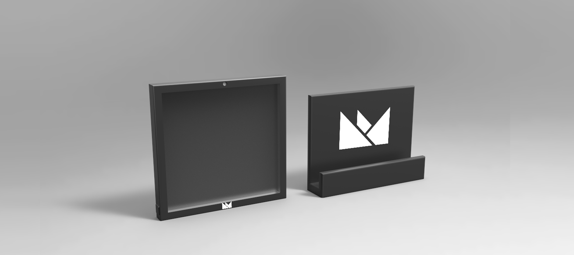
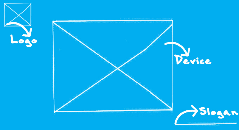
I wanted to produce a hero image for the device because it would attract attention from the intended end user of the device. I felt the hero image needed to include the logo, to tell the user who had produced the device. In the center would be the device and the bottom right would be the slogan to make the hero image memorable.
For the initial hero image, I felt the product lacked context and people might not understand what the product was for, so I decided to propose another hero image below.
Although, the device is smaller on this hero image, it is placed in context of use. The fridge allows the user to imagine the purpose of the device. The slogan also strengthens the intended purpose.